SwitchdOn
If you describe someone or something as switched-on, you mean that they are aware of the latest developments in a particular area or activity.
SwitchdOn is a startup company and imports a range of intelligent and sustainable technological devices, catering to residential and commercial consumers.
The brief was to design their brand identity, in keeping with their motto: Innovating the ordinary, creating a lifestyle.
I created their identity and expanded that to applications like brochures, packaging and brand guidelines.
Branding • Design • Art Direction
Agency: Freelance


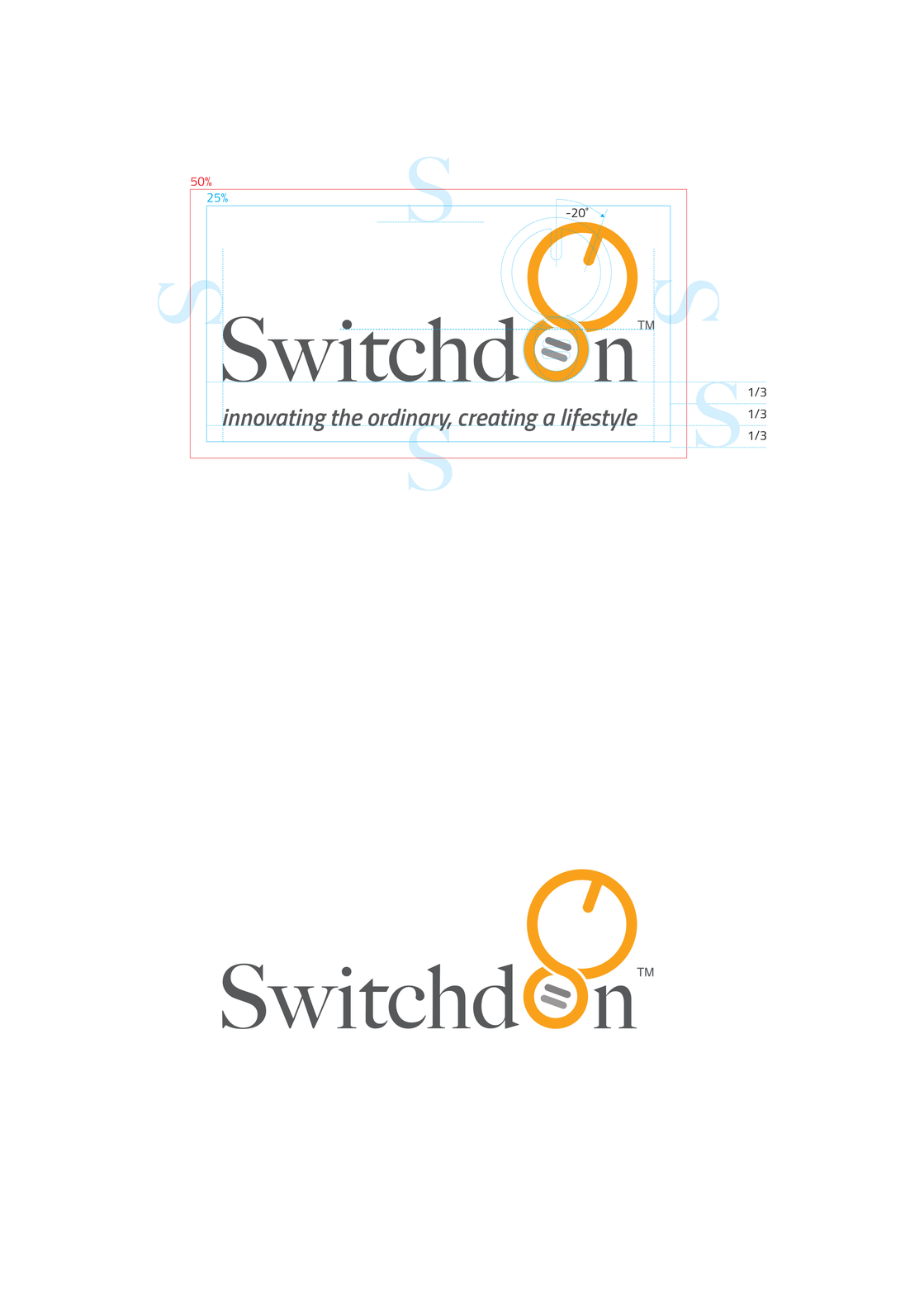
How would you visualize infinite innovation? The logo blends the infinity symbol, a lightbulb and the 'on' switch often found on electronics.

I constructed the logo on a grid and preserved the integrity and legibility of the logo lock-up by allowing a clear space area surrounding it.


A repeat pattern made up of a graphic element of the logo adorns the back of the letterhead.


I've used a simplified version of the logo as a watermark in their brand guidelines.


I've developed two secondary color palettes; one vibrant and one muted to complement the core colors.

Here, the vibrant complementary color palette is used to differentiate between the packaging of two different products.


The product brochure highlights essential products and contains detailed product specifications for wholesalers.


